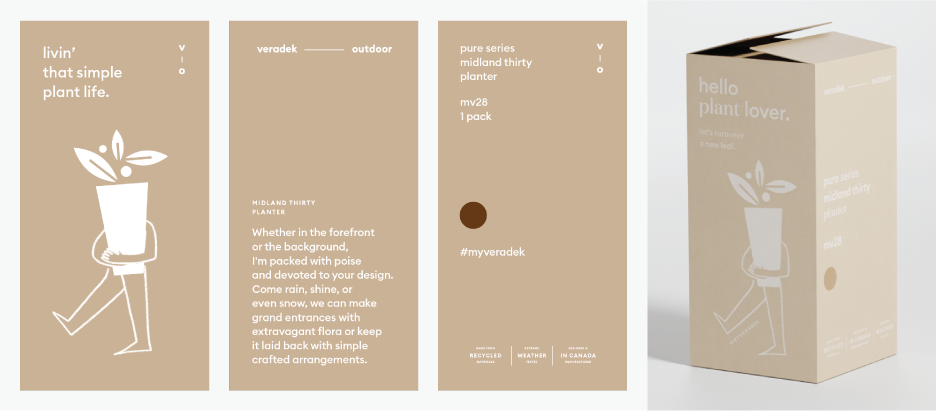
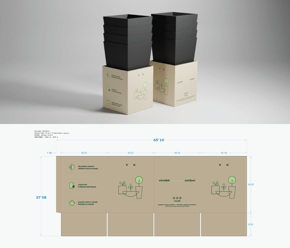
Veradek is an product company that began with a focus in outdoor planters, eventually expanding into other outdoor products such as modular privacy screens and kitchen counters. As the company expanded, there was a need for a new look and brand. The products were shipped from business to customer in cardboard boxes that featured only the company logo and internal product code. This presented an exciting opportunity to use packaging to build brand identity while also making the boxes more attractive, informative, and functional.
In order to more effectively communicate new ideas to the design team and company owners, I leveraged my 3D modelling and rendering skills to bring the team's 2D ideas into 3D visualization.
Shown above and below are product skirts that were designed to identify the Veradek brand and communicate product features in Costco warehouses. The theme in designing these was optimization - how we could impactfully communicate as much about who we were and what our products were in a relatively small footprint.
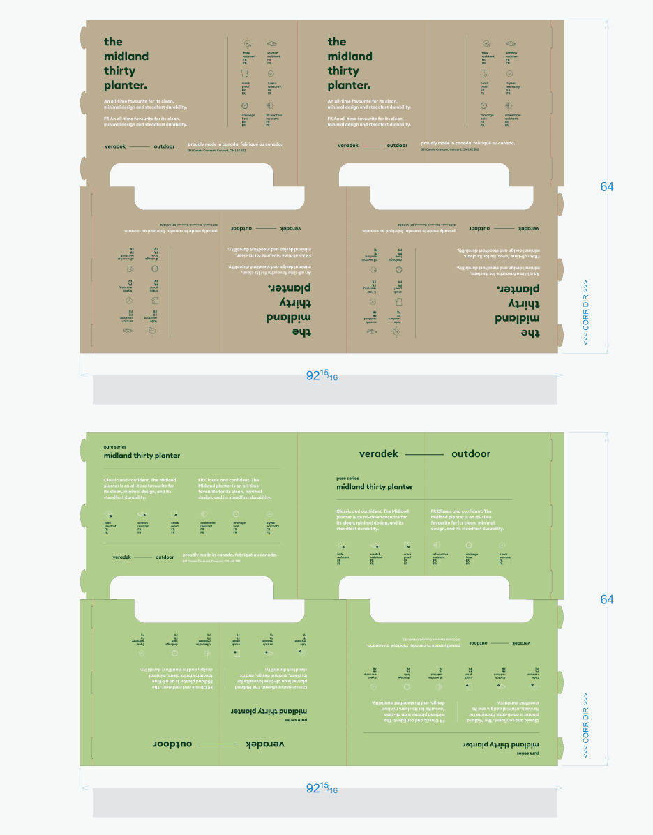


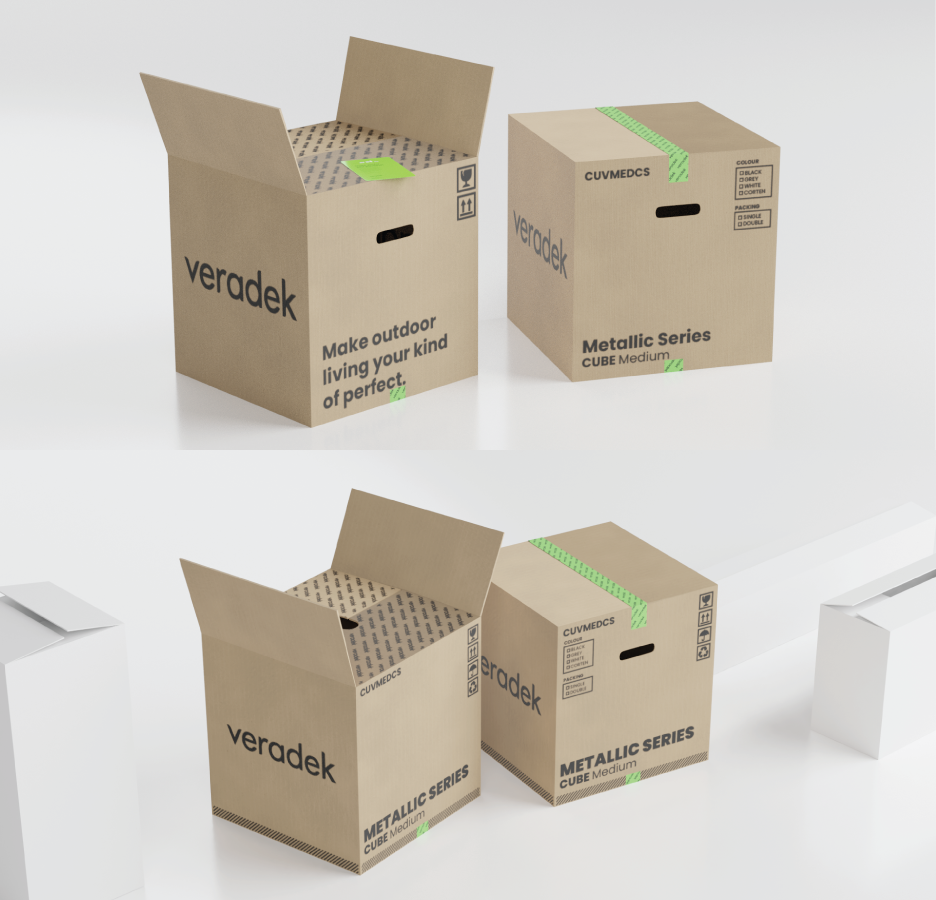
Revamping the product packaging opened the door to new possibilities in brand identity pieces and touchpoints. I explored ideas to improve user experience and interaction such as finger notches/cutouts in the box flaps, branded recyclable tape, and a friendly branded insert card. Other concepts not shown included mounting templates for hanging planters, stickers and decals, plantable packaging/drink coasters, recyclable drop sheets, and complementary mesh filters for planter drainage.
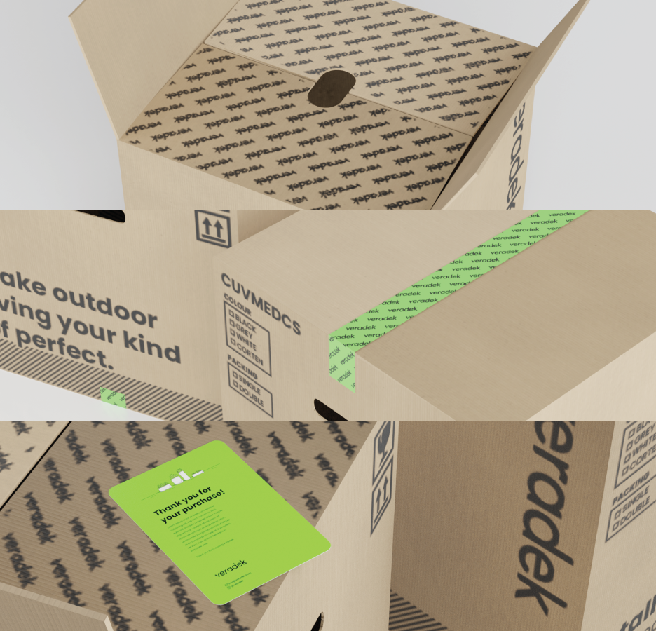
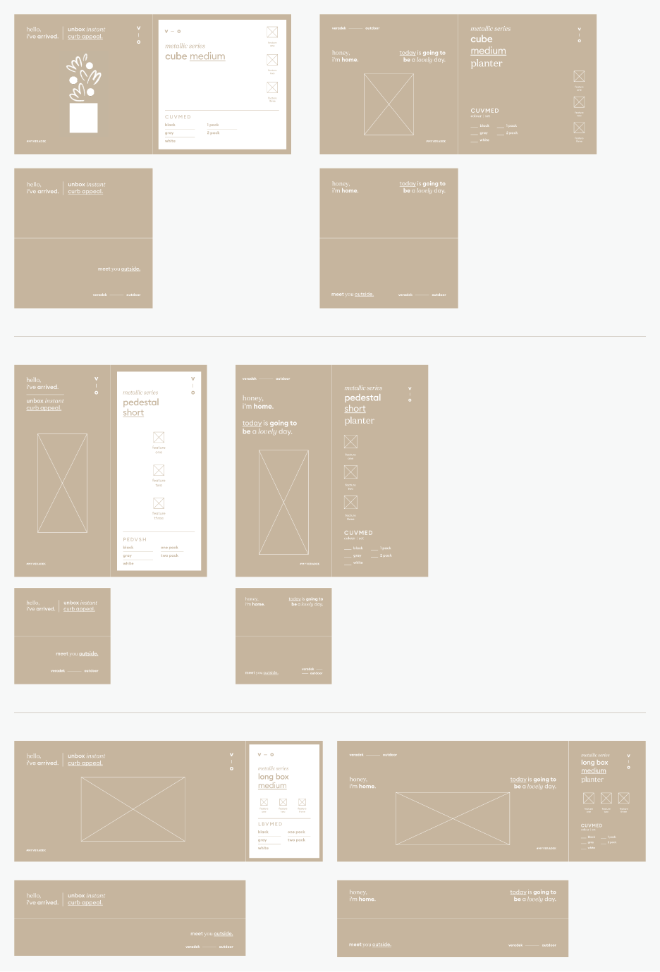
During the process of rebranding, a new creative director was added to the team to bring the creative vision of the company into a new territory. Pivoting with the updated messaging and look, I sought to create a system to solve the challenge of maintaining a consistent packaging layout across the company's varying sizes and shapes of product boxes. Some boxes would stand more than a metre tall, while others could fit atop a small table, and this required a highly intentional and effective design system that could compensate to fit any form we threw at it.
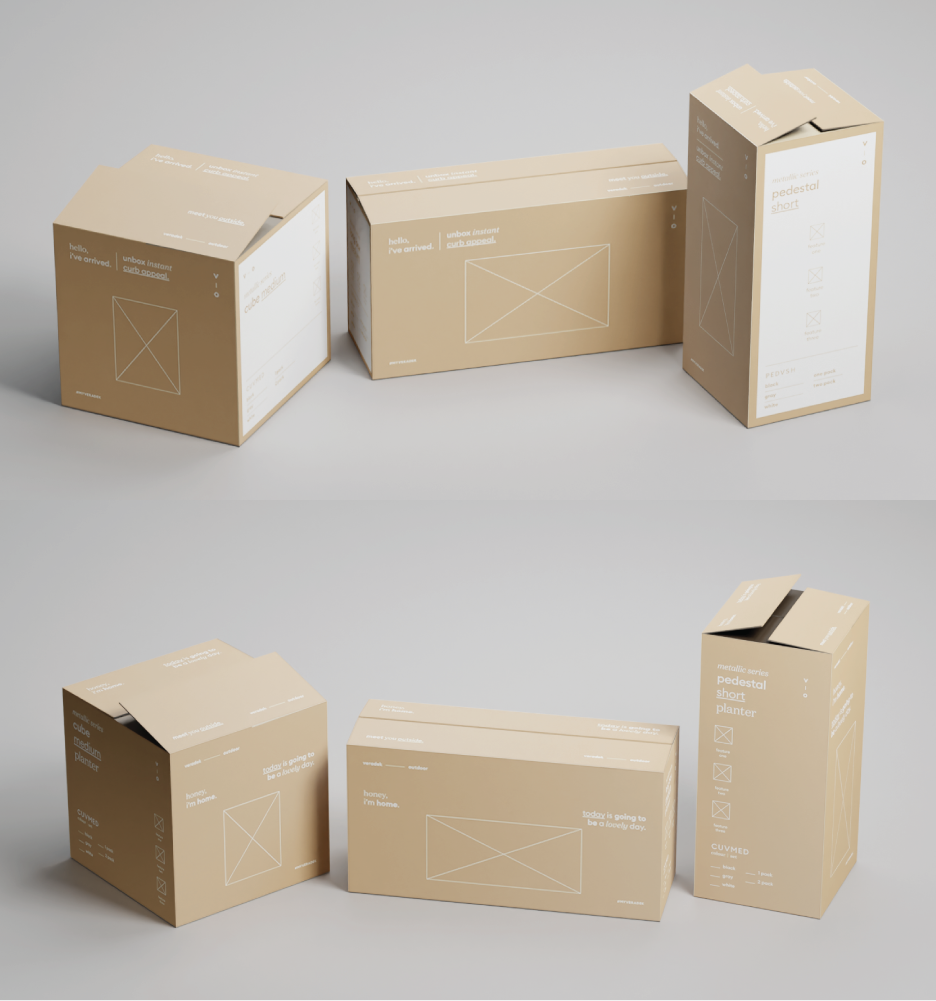
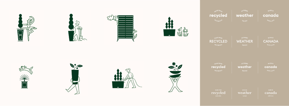

Together with the creative director and other graphic designer/illustrator on my team, we incorporated illustrations and motifs into the packaging that were customized to each product. Thie goal was to soften and tailor the branding, weaving in a sense of intention and personality. Another small but important element was creating product feature badges that the owner of the company desired as a promise of quality on every product package. The images above and below were the last iteration of design I contributed to and presented before leaving the company.
